Basics
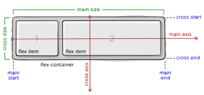
If “regular” layout is based on both block and inline flow directions, the flex layout is based on “flex-flow directions”.

Flex properties
Direction
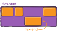
This establishes the main-axis, thus defining the direction flex items are placed in the flex container. Flexbox is (aside from optional wrapping) a single-direction layout concept.

.container {
  flex-direction: row | row-reverse | column | column-reverse;
}
Align self

Issue: Flexbox "align-items : center" shrinks a child's max-width[1]
.container {
  align-self: center;
  max-width: 200px;
  width: 100%;
}