标签:2017版源代码编辑 |
标签:2017版源代码编辑 |
||
| 第12行: | 第12行: | ||
[[Image:flex-direction.svg|200px|thumb]] | [[Image:flex-direction.svg|200px|thumb]] | ||
<syntaxhighlight lang="css"> | |||
.container { | |||
flex-direction: row | row-reverse | column | column-reverse; | |||
} | |||
</syntaxhighlight> | |||
2024年12月8日 (日) 15:15的版本
Basics
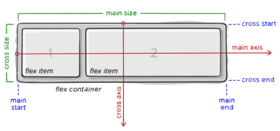
If “regular” layout is based on both block and inline flow directions, the flex layout is based on “flex-flow directions”.

Flex properties
Direction
This establishes the main-axis, thus defining the direction flex items are placed in the flex container. Flexbox is (aside from optional wrapping) a single-direction layout concept.

.container {
  flex-direction: row | row-reverse | column | column-reverse;
}